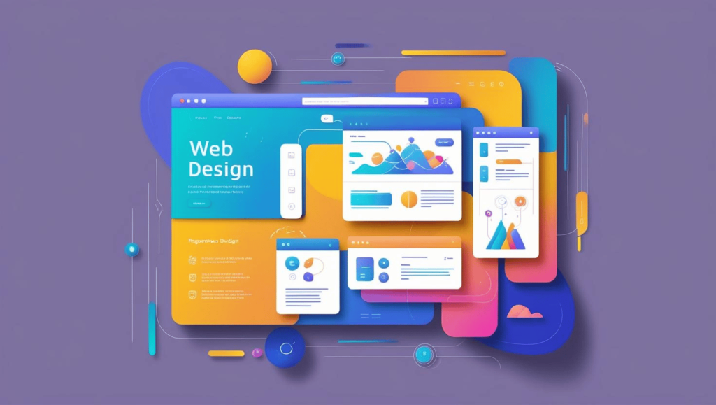
With ever-increasing growth in internet use and related technologies, it becomes critical to have a good website. Your website is the first and most direct representation of your business that anyone will see when deciding whether to work with you. So when considering web design, you should not think it’s just an aesthetic element; it actually helps improve conversions. To content marketing professionals, web design is a significant factor in how content can be easily located, shared, and used.
Visual Design and Layout
A simple and clutter-free layout enables the site’s visitors to pay attention to the content that you have shared. The template is clean with large margins, clear headers, clean and intuitive menus, logical and divided layouts of the pages, and quickly found calls-to-action make the navigation through each page flow very smoothly. First of all, if the design of your website is messy and cluttered, people will not even bother to read something of value that you posted, but will just click away instead. Additionally, visually, you must be consistent with every page, which helps to consolidate your brand identity.
Scannable Content
Most web visitors do not read from bottom to top or from left to right but rather skim through the page quickly. Web design must lay contents out so they can be scanned using short paragraphs, brief headlines and subheadings, highlighted lists, bold words, and clear separation between ideas. The above scannability elements enable points of interest to stand out. They will allow the visitor to get an overview of the main points within a page. Additionally, they help in SEO by emphasizing some keywords that will make sites rank effortlessly.

Mobile Responsiveness
In light of smartphone usage being on the rise, having a friendly, responsive design on a mobile phone is now imperative. Any content that has to be viewed sideward on the phones or that has to be viewed with the kind of squint that can cause headaches will put off visitors. Relative measures and images that alter their size based on the respective screen from which they are viewed are what make responsive web design. Your site should be easily readable and fully clickable on smartphones, tablets, and desktops.
Calls-to-Action (CTAs)
Having great content is a positive feature, but no one buys anything just because of content, if there are no calls-to-action. Web design should incorporate conspicuous clickable CTAs on your web content at relevant locations. For newsletter subscriptions, article downloads, etc., CTAs lure a visitor’s interest and hardcode desired actions. CTAs should enhance the overall contrast of the page using colors, buttons, boxes, or something similar, making sure they are not overpowering.
Shareability Features
Using social media share buttons and sign-up forms in pertinent sections of your site will enhance the responsiveness of your site. Since pop-up forms, sliding forms, banners, and similar items interrupt the site’s navigation, web designers should use them sparingly. However, options such as tweet, pin, forward, save, or subscribe are small but effectively located to get the visitor to share your content with their followers.
Search Engine Optimization (SEO)

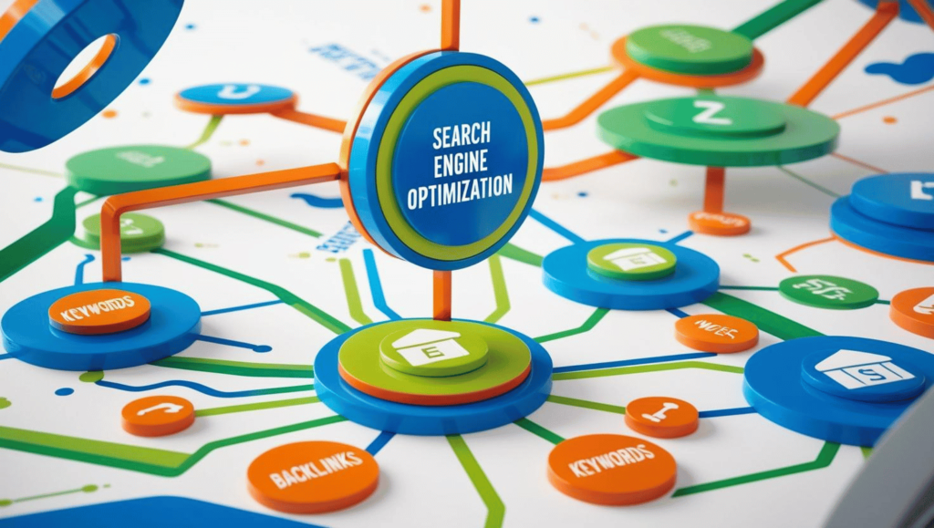
There are specific factors related to web design and site architecture decisions that can improve organic search results visibility. All the aspects on the technical side of things are relevant–title tags, meta descriptions, alt text, schema markup, etc.–so that the search engines can index your pages correctly. An SEO-optimized, mobile-friendly site assists in elevating your position so the appropriate customers can find what’s relevant.
Navigation Menus
It should be easy to find content related to the subject, which gives the visitor a reason to stay on your site longer. Your website should have a clearly labeled primary navigation menu so visitors can click their way to other relevant pages. If content has to be searched awkwardly or if more of it can be accessed only with unintuitive clicks, the users lose their trust in your site.
Page Speed
One of the most significant website design issues is the slow rate at which webpage content is loaded. Some pictures, moving pictures, flashes, complicated codes, and other wed-locking attributes can ruin overall site performance. If it takes more than two seconds, a visitor will leave the site; speedy page loading is expected by users. Web site design that is lean and minimal can load pages quickly without sacrificing design aesthetics. Faster access leaves visitors content-focused and does not annoy them with unnecessary and unresponsive delays.
Conclusion
Having interesting content for the websites is not enough; it requires an equally attractive web interface for the contents to be hosted on. A clutter-free and aesthetically clean and consistent design helps a user find content a lot easier, and it makes the messaging a lot clearer to the intended target audiences. When the website is designed in a way that allows for easy sharing of content or taking an action, then there will be better conversion rates than if the design used hinders this. When you apply web design to make your content easily approachable and in the best light, you provide your audience with a tool to quickly get, comprehend, and make use of the solutions that you offer, which is the main objective of content marketing.


