User experience (UX) is everything in the context of the modern digital environment. Websites are continuously being changed into being more interactive, engaging and user friendly. Modal web design is one of the design tools applied to improve user experience. You have probably touched a modal window whether you are online shopping, registering with a newsletter or logging in to your account.
What is modal web design, however? What is its mechanism, and in what situations does it need to be applied? This paper has simplified all of this.
Understanding Modal Web Design
What is a Modal?
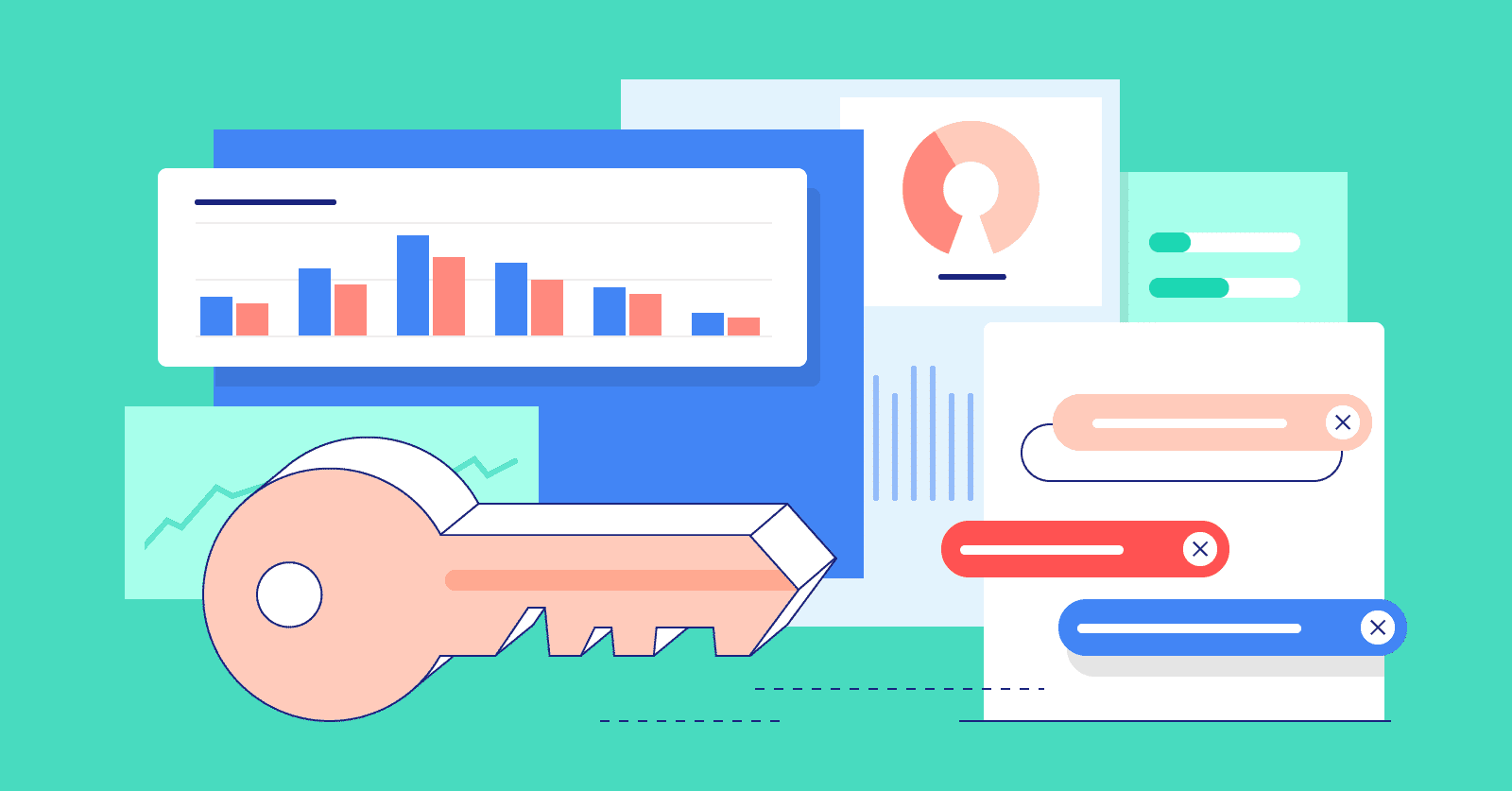
The element of the user interface that is placed over the main webpage content is called a modal. It is more of a pop-up window where the user has to touch on it before coming back to the center of the work. This communication might be a simple click of a button or even the modal itself.
Modals are often used for:
- Sign-in or sign-up forms
- Alerts and confirmations
- Promotional offers
- Viewers of the media (such as image or video pop-ups)
- Input forms and surveys.
Modal vs. Pop-Up: What’s the Difference?
Though modal and pop-up are interchangeably used, there is a major difference:
- The webpage also has modal windows which are typically designed in line with the site.
- Pop-ups usually turn out as new browser tabs or new windows and are blocked by browsers.
Concisely, modals are purposeful and deliberate components of your web design.
How Modal Web Design Works
Overlay and Focus
On displaying a modal, it usually obscures the rest of the screen with an otherwise transparent overlay. This aids in capturing the attention of the user to the modal window. It also does not allow interaction with the background till the modal is closed or the necessary action is carried out.
User Interaction
The main aim of a modal is that it requires a user action.
For example:
- A user must click “OK” or “Cancel”
- A user must fill out a form
- To get on with browsing, a user has to close the modal.
Because of this, modal design is often described as “interruptive” but purposeful.
Key Elements of a Good Modal Design
A designed modal ought to be easy to use, convenient and sensitive.
Here are the key elements:
Clear Call to Action (CTA)
A visible CTA on the modal should consist of:
- “Submit”
- “Log In”
- “Sign Up”
- “Learn More”.
Close Button
Provide an easy means of leaving the modal to users, which could be an X button on the corner or a cancel button.
Responsive Layout
The modal ought to be compatible with all the sizes of the screens including mobile phones. This guarantees the availability and smooth experience.
Consistent Design
Modals must be in keeping with the general appearance and feel of your site such as fonts, color, and space.
Benefits of Modal Web Design
Focused User Engagement
Modals are excellent attracters of important messages or actions because they momentarily occupy the screen.
This renders them suitable to advertise:
- Discounts
- Limited-time offers
- Critical alerts.
Improved Conversions
Some of the modal applications used by many businesses to capture leads include:
- Newsletter sign-ups
- Free downloads
- Account registration.
Timely modal can be of great help in increasing the conversion rates.
Streamlined User Experience
Users do not have to leave the page to do something in another one and do everything in the modal, which makes it quicker and more effective.
When to Use Modal Design (and When Not To)
Best Situations to Use Modals
- Short processes which do not require a full-page (e.g. login, newsletter subscriptions)
- Firming up or warning messages, such as “Are you sure you want to delete this?
- Video or picture preview, without change of page.
- Advertisements of short-term deals.
When to Avoid Modals
- In case the task is long or complicated (e.g. multi-step forms)
- In case the users may have to refer to the background information.
- In case it is overused, causing annoyance or modal fatigue.
Excessive modals or bad-timed modals are detrimental to the user experience and can even raise the bounce rate.
Accessibility and Modals
ADA and WCAG Compliance
The websites should be accessible to the users with disabilities, in accordance with the ADA and WCAG (Web Content Accessibility Guidelines).
Modal windows must:
- Be keyboard-navigable
- Add focus trapping (ensuring the user remains in the modal whilst it is open)
- Should have clear and descriptive labels.
- Warn against changes to screen readers.
The lack of concern towards accessibility can render some users avoid using modals and even be the cause of legal consequences.
Modal Design Best Practices
The following are some of the modal design tips:
Use Sparingly
Modals should only be used when it is imperative to. Overuse can frustrate users.
Time It Right
There is no need to activate modals when a person visits your site.
Wait until:
- The user has scrolled a bit
- They have taken time on the page.
- They demonstrate intent to exit (they move the mouse and close the tab).
Keep It Simple
Modals must be simple and to the point. Limit the number of input fields or buttons and do not clutter.
Test on All Devices
You have to test your modal design on desktop, tablet and mobile devices always so that you can be sure that the user is having a smooth experience in all your boards.
Examples of Modal Use in Popular Websites
Amazon: Displays modal windows when logging in and when adding objects to a wish list.
YouTube: Deletion and content reporting modal confirmations are required.
E-commerce stores: The exit-intent models are frequently used to provide discounts to a user prior to their departure.
By modular design, these companies direct users without imposing on them.